
Visualizing Positive & Negative Ratios with Custom SVG Bars
Visualizing Runtastic Data
22/08/2022
New PowerBI KPI Card with References and Line Chart
30/11/2023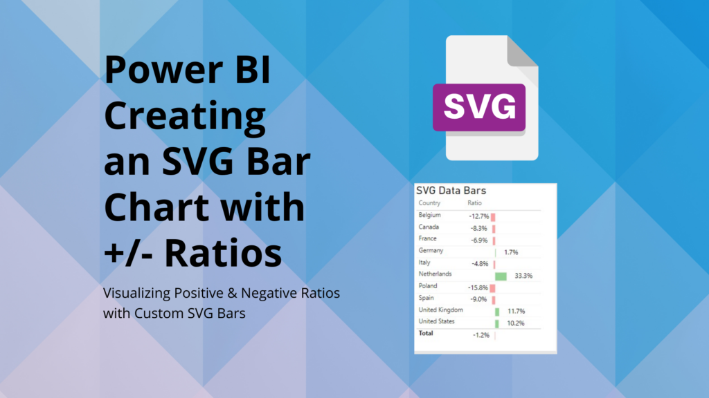
1. Introduction
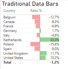
SVG Bar Charts: Alright, here’s my story. On one of my recent projects, I was tasked with creating a table that displayed a ratio. At first, I thought data bars would be the answer. But there was an issue—the text always sat on the right, regardless of whether the value was positive or negative. To make matters worse, sometimes the text would overlap with the bar chart. Not exactly user-friendly, right? Plus, also not what the client needed at that point. I tried to google and adjust the settings, but nothing really helped…Until I stumble uppon SVG images!
Then, inspiration struck when I stumbled upon an SVG video on YouTube from How to PowerBI. Check it out to get a deeper understanding of SVGs in PowerBI. With some trial and error, and some nudges from chat GPT, I finally landed on a solution I was proud of. Admittedly, adjusting the parameters took some time, but I slowly got the hang of it, understanding the nuances of image sizes and other variables. The best part? I’ve documented everything here, making it easy for others to use and adapt.
2. The Power of SVG Images in PowerBI
Scalable Vector Graphics, or SVG, isn’t just another image format. It’s a game-changer for designing visuals in PowerBI. Let’s break down why:
- Vector Graphics: Unlike JPEGs or PNGs that use pixels, SVGs are made of paths, shapes, and fills. This means they’re essentially math formulas representing images. And since math is precise, these images can scale up or down without losing clarity.
- Scalability: Regardless of how much you zoom in or out, SVGs ensure your visuals remain crisp and sharp. This attribute eliminates the blurriness often associated with resizing raster images.
- Customization: With SVG Bar Charts, you’re not confined to the default visuals of PowerBI. Whether you want to change colors, shapes, or sizes, SVGs are versatile and adaptable.
- Aesthetic Appeal: Beyond their customization capabilities, SVGs can represent complex designs and patterns. This intricacy offers a professional flair to your visuals.
- Interactive Visuals: SVGs aren’t just static images. They can be scripted and animated. This allows for visuals that can interact and change based on user inputs or data updates, making your PowerBI reports feel alive.
- Compact File Size: Despite their versatility, SVGs often have smaller file sizes than their raster counterparts. This ensures your PowerBI reports load swiftly.
- Standout Reports: By using SVG visuals in PowerBI, you’re ensuring that your reports aren’t just informative, but also visually enticing.
Diving into SVGs might seem technical at first, but the payoff in terms of visual clarity and customization in PowerBI is well worth the effort. When data representation meets visual elegance, that’s where SVG shines!
A great website to find SVG images and the code is svgviewer.com
3. Step-by-Step with SVG Bar Charts in PowerBI
- Start Fresh: In PowerBI, create a new measure.
- Grab the Code: Ready for some magic? Just copy the code from below.
- Choose the Right Data: Use a measure that shows a ratio. It could be anything with a share of positive and negative change. Something with ups and downs.
- Tweak and Twirl: Now, get your hands dirty. Change the code, play around. Make the SVG Bar Charts scream “you.”
You can change the variables “Var” and change the size, style, color etc. - And hey, while experimenting, I did have a chat or two with ChatGPT. Because a little help goes a long way, right?
SVG Bar Chart =
-- Canvas Definitions
VAR SVGWidth = 250                            -- Width of the SVG canvas
VAR SVGHeight = 40                            -- Height of the SVG canvas

-- Data and Formatting
VAR _Measure = [Total Cost Ratio Ref]         -- Retrieve the ratio value from another measure/column
VAR Formatted_Measure = FORMAT(_Measure, "0.0%")  -- Format the ratio value for display

-- Color Definitions
VAR PositiveBarColor = "#92D293"              -- Color for positive values
VAR NegativeBarColor = "#FAA0A0"              -- Color for negative values
VAR BarColor = IF(_Measure >= 0, PositiveBarColor, NegativeBarColor)

-- Bar Dimensions and Positioning
VAR CenterPosition = 100                      -- Center of the SVG canvas for bar placement
VAR BarWidth = ABS(_Measure) * (SVGWidth /2)    -- Width based on the ratio and canvas size
VAR BarHeight = 40                            -- Height of the bar
VAR BarStartX = IF(_Measure >= 0, CenterPosition, CenterPosition - BarWidth)  -- X position of the bar

-- SVG Text Positioning and Style
VAR TextPadding = 30                          -- Space between bar and text
VAR TextWidth = 50                            -- Estimated width of text
VAR TextFontFamily = "Segoe UI"               -- Font family for text
VAR TextFontSize = "24"                       -- Font size for text
VAR TextFill = "black"                        -- Font color
VAR NumberPositionX =                         -- Determine text X-position based on bar direction (positive or negative)
IF(
    _Measure >= 0,
    CenterPosition + BarWidth + TextPadding,
    CenterPosition - BarWidth - TextPadding - TextWidth
)

-- SVG Creation
VAR Img =
"data:image/svg+xml;utf8,<svg width='" & SVGWidth & "' height='" & SVGHeight & "' xmlns='http://www.w3.org/2000/svg'>
<rect x='" & BarStartX & "' y='10' width='" & BarWidth & "' height='" & BarHeight & "' fill='" & BarColor & "'></rect>
<text x='" & NumberPositionX & "' y='30' font-family='" & TextFontFamily & "' font-size='" & TextFontSize & "' fill='" & TextFill & "'>" & Formatted_Measure & "</text>
</svg>"

RETURN Img
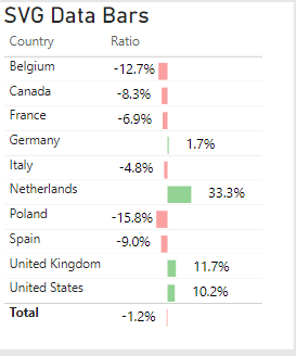
To be fair, it took me a while to have the SVG adjusted to my liking but it was worth it. My two initial problems are gone. Now the ratio text is on the left or right side, depending on if it’s a positive or negative value. Also, the text is no longer overlapping the bar, which makes it more readable.
4. Conclusion
Navigating the waters of data visualization might seem daunting, but once you dive in, the possibilities are truly endless. Using SVG Bar Charts in PowerBI doesn’t just make your data look good—it also brings clarity, precision, and innovation to your fingertips. While the journey of crafting the perfect SVG bar chart had its challenges, the result was undeniably worth the effort. It’s a testament to how technology, inspiration, and a touch of creativity can come together to transform raw data into insightful visuals.
Call to Action: Now, it’s your turn! I’d love to see the unique ways you apply this technique. If you’ve found this guide helpful or have any questions, don’t hesitate to drop a comment below. Better yet, share your creations with our community! Let’s learn, innovate, and grow together. And if you’re hungry for more tips and tutorials on PowerBI, follow me on LinkedIn where I post about PowerBI and Data Analytics. Happy visualizing! 📊✨
