
How to Add a Line Break in Power BI

How to Create a Dynamic Date Table in Power BI with DAX
10/12/2023
How to Create a Dynamic Territory Report in Power BI for Germany
19/12/2023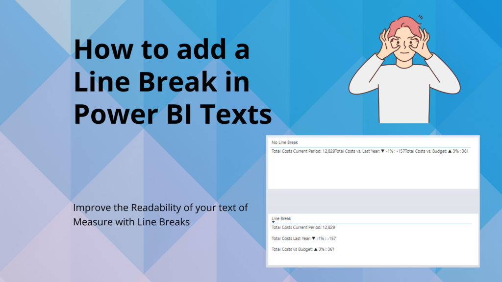
Today, I want to share a simple, yet handy trick for your Power BI reports – The Line Break in Power BI! Ever noticed how your text elements can become too long and hard to read? That’s where a neat little function, UNICHAR(10), comes into play in DAX. It’s all about adding those much-needed line breaks to separate your data points. So, let’s dive into this quick tip to tidy up your visuals!
What are the advantages of a line break in Power BI?
To insert a line break within DAX, the UNICHAR(10) function is your go-to tool. Picture having your measures – Total Cost Current Period, Total Costs vs Last Year, and Total Cost vs. Budget – all cramped up on one line. Now, by strategically placing & UNICHAR(10) & between these measures, you effectively distribute them across separate lines. This straightforward tweak significantly boosts the readability of your data.
What does Unichar 10 mean?
UNICHAR(10) in DAX is a magical little function that returns the line feed character, which is the standard new line character in text. It’s like hitting “Enter” in your DAX code.
What are the advantages of a line break?
Line breaks in DAX, like using UNICHAR(10), transform cluttered text into clear, readable information. For instance, consider a measure without line breaks: Each text in string is written on a new line in the DAX measure, however that does not mean that the output is written in line breaks!
Consider following DAX Measure, where we have 3 lines of code written in DAX:
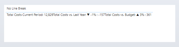
No Line Break =
"Total Costs Current Period: " & FORMAT([Total Costs AC], "#,0") &
"Total Costs vs. Last Year: " & [mKPI Total Cost ref] &
"Total Costs vs. Budget: " & [mKPI Total Cost BU]
Output with no Line Break in Power BI:
As you can see, the text and numbers are hard to read and hard to distinguish. The screenshot shows a standard table visual in Power BI.
Power BI output with Line Break using Unichar(10):
If you simply add Unichar(10) to your measure, you automatically get a linebreak. I added two Unichar(10) variables so I create an additional space between the rows with text:
Line Break =
"Total Costs Current Period: " & FORMAT([Total Costs AC], "#,0") & UNICHAR(10) & UNICHAR(10) &
"Total Costs Last Year: " & [mKPI Total Cost ref] & UNICHAR(10) & UNICHAR(10) &
"Total Costs vs Budget: " & [mKPI Total Cost BU]
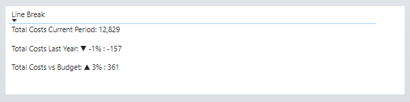
The difference? The latter separates each metric onto its own line, making the visual clear and easy to digest. Line breaks aid in distinguishing between different data points, ensuring that each element gets the attention it deserves.
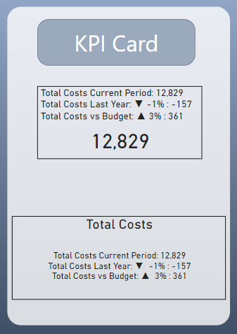
Line Breaks in other visuals like KPI Cards
Did you know that you can also use UNICHAR(10) for line breaks in standard KPI Cards in Power BI? This versatile function can be applied not just in the body text but also in the titles or the value fields of KPI Cards. It’s a great way to separate different elements within a card, like breaking up a lengthy title or dividing multiple key figures listed in the value field. By using line breaks in KPI Cards, you can make each piece of information stand out more prominently, making your KPIs clearer and more impactful at a glance.
Important: For KPI Cards it is important that TEXT WRAP is enabled in the formatting options! A small difference compared to the Table visual is that there is no extra space between the rows. It does not seem to work with the KPI Card.
The KPI Card on the top has the measure in the title while the KPI Card in the bottom has the measure in the Value section. You can play a little bit around what you like more. Of course, you can use the measure as a dynamic title in other visuals, such as bar charts as well.
Conclusion: Line Break Power BI
In conclusion, the small addition of line breaks using UNICHAR(10) in Power BI can make a significant difference in how your data is presented and perceived. Whether it’s in standard measures or KPI Cards, this simple yet effective technique helps in breaking down information into easily digestible parts, thereby enhancing readability and overall impact of your reports. It’s amazing how a small change can bring about such a noticeable improvement in data visualization. Try it out in your next Power BI project and see the difference for yourself!
.
.
.
.
