
How to Compare Actual Results to Budgeted Results in Power BI

Year-over-Year Comparison with Deneb Custom Visual
26/12/2023
How to Create a Dataset for Power BI Using Chat GPT
13/08/2024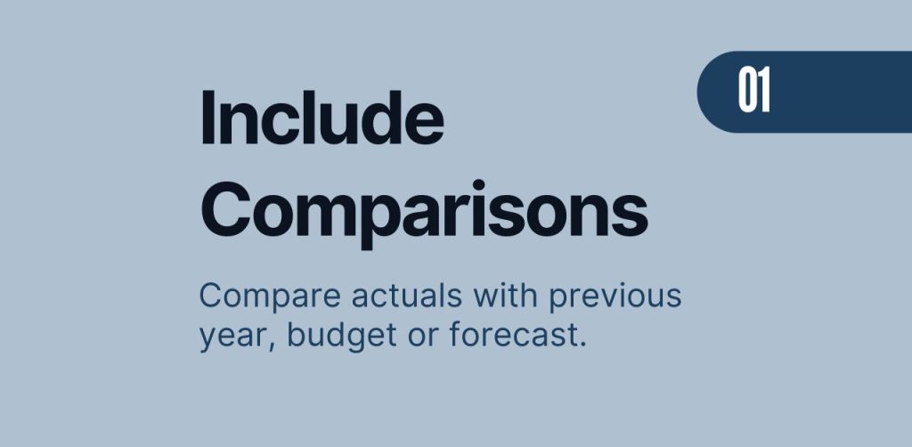
Welcome to today’s post in my new series on making your Power BI reports more dynamic! Today, I’m diving into how to compare actual results to budgeted results—an essential skill for anyone looking to make informed, data-driven decisions.
Why Compare Actual Results to Budgeted Results?
Understanding where your business is hitting the mark and where it’s falling short is crucial. Here’s why comparing actual results to budgeted results matters:
- Spotting Trends: Quickly identify patterns and respond proactively.
- Planning Ahead: Refine future budgets and strategies with insights.
- Optimizing Resources: Allocate resources where they matter most.
- Actionable Insights: Provide clear, numbers-based answers for management, enhancing their ability to explain variances to the CFO or a larger audience.
Having both actual and budget data in one place saves time and prevents headaches. In my previous job, I struggled with this process. I had to copy-paste data into Excel because I didn’t know how to connect actuals and budgets in Power BI. It wasn’t efficient, but that’s where I started. This series aims to show you an easier, more efficient way to make these comparisons in Power BI.
Setting Up Your Data Model for Budget vs. Actual Comparison
A well-structured data model is key to smooth comparisons. Here’s how to set it up:
- Gather Your Data:
- Collect both actual, budget or forecast data in separate tables.
- Create separate dimensions tables like time, product, and region.
- Build Your Data Model: (THIS STEP IS CRUCIAL!)
- Set up dimension tables in 1-to-many relationships with fact tables, including:
- Date Table
- Customer Table
- Product Table
- Country or Region Table
- Set up dimension tables in 1-to-many relationships with fact tables, including:
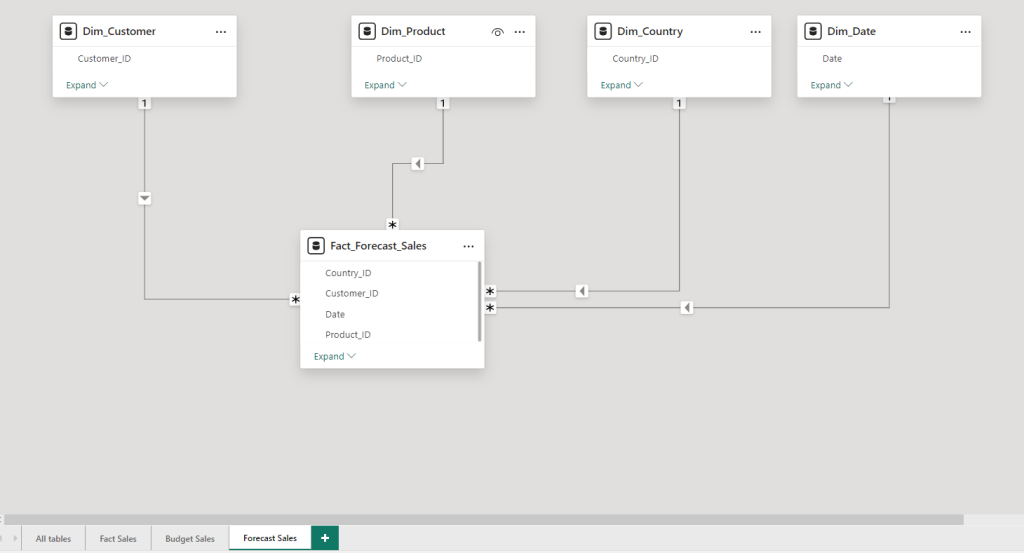
Below is an example of my forecast (the budget table is identical) fact table and the 1 to many relationships. You need to make sure that every Customer ID, Product ID, Country ID and Date is part in both the dimension table as well as the fact table!
- Add a date column in your Budget Date (beginning or end of the month) and connect it to the date dimension table. Often companies only have text strings like January or Mar 22 etc. as columns. You need to find a way to create a date data type column so you can connect it to the date dimension table. I wrote a detailed article, how to create a dynamic date table using Dax. In there, I shared step by step guidelines as well the Dax code that you need.
- Same Column Structure: Ensure Actuals, Budget and Forecast or other fact tables tables have the same structure! If the budget table does not have any country or customer column but your fact sales table has, you simply cannot compare the actuals of a certain customer with the budget. Because it simply does not exist. The tables in my example are all very simple and in reality, there might be cases where it is not that aligned. All my fact budget, forecast and actual tables have a date, product_id, customer_id and country_id column. This ensures comparability!
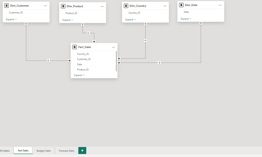
My actual fact sales table looks very similar, with all 1 to many relationships to each dimension table.
Pro Tip: Click the green collapse text to only show the columns that have relationships. This makes it easier to see which columns from the fact and dimension tables are used!
If you want to follow along you can create a portfolio dataset using chat GPT (I recommend the 4 or 4o). In the first article of this series, I provided you with step-by-step instructions. This includes the prompt I used which will give you an excel file. This file includes all your fact and dimension tables for this project. In the end of the article, I am sharing the whole Power BI Desktop file with you for free!
How to handle monthly budget or forecast data?
Often, forecast or budget do not come at a daily level of granularity, but rather monthly. I have seen excel files named Budget March 2022 or separate sheets within an excel file that contains just the month name. It is important that you find a way to create a date field column in the budget / forecast data. Only if you have a date type column, you can connect it with the date table.
In our simplified example, we have a date field available. However, we only chose the start of the month. This means like January 1st. of February 1st. and so on. The advantage is that based on that field you can create your monthly aggregation and connect it to the date table. Important to understand: In this scenario we cannot compare budget versus daily sales as the highest level of aggregation is by month! It is possible with custom measures, but this is a topic for another blog post.
Using Zebra BI Visuals to Compare Actuals with Budgeted Results in Power BI
With your data model ready, it’s time to visualize it using Power BI and Zebra BI visuals. Zebra BI is known for creating actionable insights following the International Business Communication Standards (IBCS). It does come with a yearly fee and therefore is most likely only relevant for enterprise customers, not individuals. However, you can sign up for a free 30-day trial. Learn more about Zebra BI using this (affiliate) link. Personally, I am using it with all my clients, as it makes my life as a Power BI developer so much easier!
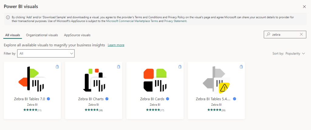
- Add Zebra BI Visuals:
- Go to the app store and search for Zebra BI (Get more visuals…)
- Download their table, charts and KPI card visual
- I love Zebra BI visuals because they require only two measures to create easy-to-understand visuals. You can directly see which month or product performed well or poorly, indicated by color. There are many more advantages, but I’ll cover those in another blog post.
- Add licence key or get a 30 day trial:
- As Zebra BI does come with a cost, you need to enter a license key or start a free trial. You can still use the visual without a key or free trial, but the functionalities are very limited!
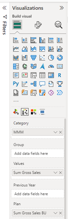
- Visualize Your Data Over Time:
- Use the Zebra BI chart visual to show trends over time
- Use the Month or Year column from the date table and add it to the Category field.
- Add your actuals (Values) and budgeted measures (Plan). In my case its a simple “sum” function of my gross sales or net sales from each of the tables.
- Explore and Understand:
- Use Power BI’s interactive features to drill down and gain deeper insights. Focus on the largest red or green areas first. In this case, October was 2.3 percent below budget which means an absolute deviation of 6k Euro. Now explore other categories to understand what’s driving the negative trend in October.
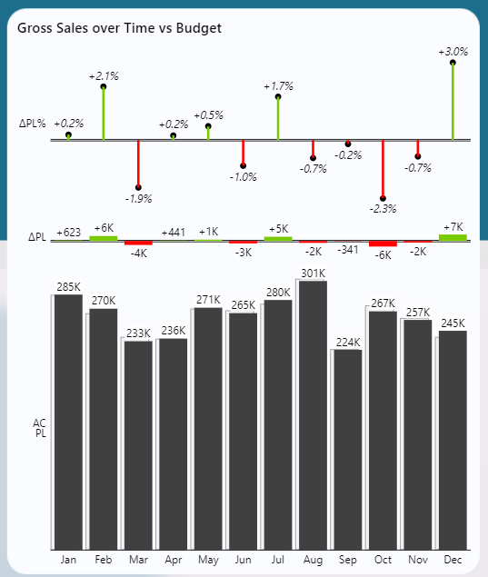
By following these steps, you’ll have a dynamic dashboard showing how actual results stack up against your budget, helping you make informed, data-driven decisions. Easily focus on the months that performed above or below expectations and then look at the categories to understand the drivers behind it.
It is that easy!
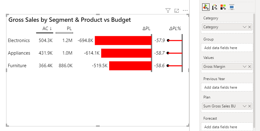
If you want to see your actuals versus budget by the product category – no problem!
- Click on the Zebra BI table visual
- Use your product category column from the Dimension table and move it in the Category field (ensure it has a connection with both tables, actuals and budget)
- Add your sum of sales from the actuals in the Values field
- Add your sum of sales from the budget data in the Plan (which also stands for budget) field
Still Confused? No Problem!
Download my Power BI Report for free, including all measures, data models, and settings for free using the link below!
Conclusion
Comparing actual results to budgeted results in Power BI is a powerful way to keep your finger on the pulse of your business performance. By setting up a solid data model and leveraging the visualization power of Zebra BI, you can turn raw data into actionable insights with ease.
Stay Tuned
This is just the beginning! Stay tuned for more posts in my series on making your Power BI reports more dynamic. I’ll cover a range of topics to help you get the most out of your data. In the next post, you will see how to dynamically switch between different KPIs across all your visuals, such as gross sales, discounts, and net sales, without the need for extra buttons or bookmarks!
.
.
.
