
Using Power BI Dynamic Values for Flexible Reporting

How to Create a Dataset for Power BI Using Chat GPT
13/08/2024
Mastering Power BI Dynamic Year Comparison for Multi-Year Data Insights
15/08/2024
In the world of business intelligence, flexibility and responsiveness are key. The ability to view your data from different perspectives can significantly enhance decision-making. That’s where dynamic reporting in Power BI comes into play. In this blog post, we’ll explore how to use Power BI dynamic values to create more adaptable and interactive reports.
Why Power BI Dynamic Values Matter
Dynamic reporting in Power BI empowers you to tailor your insights according to specific business needs. Whether you’re analyzing sales performance or comparing metrics across different time periods, dynamic values allow you to toggle between various KPIs seamlessly. Let’s break down the steps involved in making your Power BI reports more dynamic.
Step 1: Create an Unrelated Dim Table in Power Query
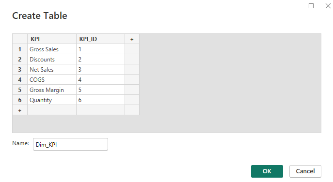
To enable dynamic switching between KPIs, first, create an unrelated Dim table in Power Query. This table will house your KPI options and serve as the backbone for all dynamic selections in your report. In our example, we created a table named Dim_KPI with KPI options such as Gross Sales, Net Sales, and COGS.
Here’s how to do it:
- Open the Power Query Editor
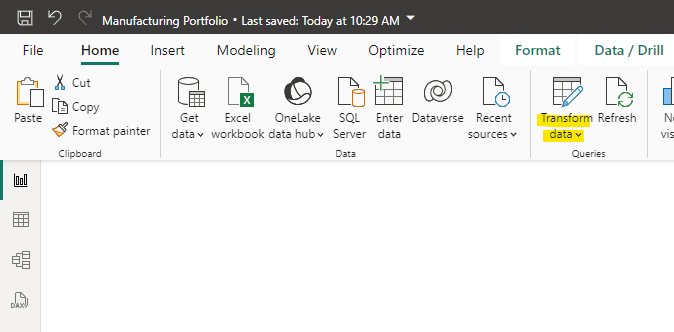
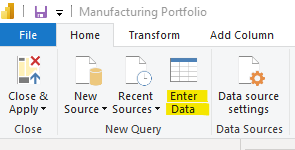
- Next, click on enter data to create a new table:
- Step 3: Name the table “Dim_KPI” and fill it with the KPIs that you want to show. In our case it is Gross Sales, Discounts, Net Sales, COGS and Gross margin. You can name them differently and also add more if you like. Make sure the KPI_ID column shows ascending values starting with 1. This will be important in a later step.
Click on OK. Congratulations! You have created a disconnected KPI table.
Step 2: Create a Measure for the Selected KPI
Now, let’s create a measure to capture the selected KPI. This measure will identify which KPI has been chosen by the user:
SelectedKPI = MIN(Dim_KPI[KPI_ID])This measure will return the corresponding KPI ID based on the user’s selection.
Step 3: Create a SWITCH Measure for the Selected KPI (AC)
Next, create a SWITCH measure that dynamically updates based on the selected KPI for our actual data (AC). Here’s how it works:
Selected value AC = SWITCH([SelectedKPI],
        1, [Sum Gross Sales],
        2, [Sum Discounts],
        3, [Sum Net Sales],
        4, [Sum COGS],
        5, [Gross Margin],
        6, [Sum Quantity])

This measure changes dynamically based on the KPI selected, ensuring your visuals stay relevant no matter which KPI is being reviewed.
Step 4: Create a SWITCH Measure for the Selected KPI (PY)
Similarly, you need a measure for the previous year (PY) to enable year-over-year comparisons:
Selected value PY = SWITCH([SelectedKPI],
        1, [Sum Gross Sales PY],
        2, [Sum Discounts PY],
        3, [Sum Net Sales PY],
        4, [Sum COGS PY],
        5, [Gross Margin PY],
        6, [Sum Quantity PY])
This allows you to track your KPIs over time and gives context to current performance.
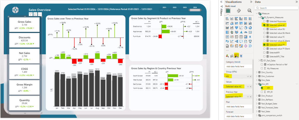
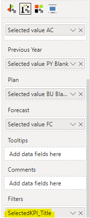
Step 5: Create a Zebra BI KPI Card
Using the Dim_KPI[KPI] column along with the AC and PY measures, create a Zebra BI KPI card that displays the selected KPI values dynamically. This card will adjust based on user input, providing a flexible and engaging way to monitor key performance indicators.
Step 6: Add a Dynamic Title to Your Visuals
To enhance the report’s user experience, create a dynamic measure title that reflects the selected KPI:
SelectedKPI_ =
IF(
        HASONEVALUE(Dim_KPI[KPI]),
        VALUES(Dim_KPI[KPI]),
        CALCULATE(
            FIRSTNONBLANK(Dim_KPI[KPI], 1),
            Dim_KPI[KPI_ID] = 1
        )
)
This measure ensures that the title is updated automatically based on the selected KPI, making your report more intuitive.
Step 7: Add the Title to the Zebra BI Filter Section
Finally, add the dynamic title to your Zebra BI visuals in the filter section. This helps users quickly understand which KPI is being displayed and allows for easier navigation within the report.
Good to know: I am still using the classic Power Bi Layout and not the On Object Orientation. In the past I had difficulties when on object orientation was enabled in the settings. The section did not appear.
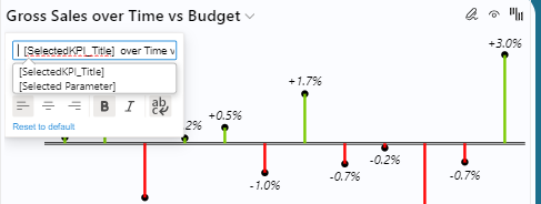
But, you are not done yet. You need to enter the measure title in the visual itself. It can be a bit tricky to work with the titles, but simply open the title section and press the space bar one or two times and then the measure title should appear:
Why I use Zebra BI for dynamic value reporting in Power BI?
Zebra BI is a powerful tool that makes reporting in Power BI more dynamic and actionable. With Zebra BI, you can easily create visuals that allow users to switch between different KPIs, compare actual vs. budgeted results, and dig deeper into your data with just a click. It’s designed to help you present complex information in a clear and consistent way, making it easier for decision-makers to understand the story behind the numbers.
What makes Zebra BI stand out is its ability to automatically adjust and display data in the most effective format, whether it’s variance charts, waterfall charts, or tables. It’s perfect for dynamic reporting because it offers seamless integration with Power BI, enabling real-time insights that drive better business decisions. You can try Zebra BI with a free 30-day trial and experience its benefits firsthand using this affiliate link below.
TRY OUT ZEBRA BI TODAY
My previous blog post How to Compare Actual Results to Budgeted Results in Power BI explains how to get and install Zebra BI visuals.
Dynamic Values in Power BI: Download the Power BI Desktop file
If you want to follow along using my Power BI Desktop file, you can do that. Use the link below and get free access to the PBIX file with all measures, data models and settings.
Conclusion
By following these steps, you can significantly enhance the flexibility of your Power BI reports using dynamic values. This setup allows for smooth transitions between different metrics, enabling deeper analysis and better decision-making. Ready to take your Power BI reporting to the next level? Start experimenting with dynamic values today!
If you like this type of series, I would be very happy if you give me a comment, share this post or follow me on LinkedIn.
