
Power BI Tooltips: Enhancing Your Reporting with Dynamic Insights

Visual Level Filters in Power BI: How to Filter One Visual by Another
16/08/2024
Power BI Drill Through vs Drill Down: Differences and How to Use Them
16/08/2024
This post is part of my series on making your Power BI reports more dynamic. Today, we’re focusing on Power BI tooltips and how they can add deeper context to your visuals. Tooltips are often overlooked, but they can play a huge role in improving user experience and making your reports more interactive. Let’s dive into how you can use tooltips effectively and make your reports stand out.
Why Power BI Tooltips Matter
Tooltips in Power BI are small but powerful features that display extra information when you hover over a data point. Instead of cluttering your visuals with too much data, you can use tooltips to show additional context only when needed. This keeps your main report clean while still offering in-depth insights.
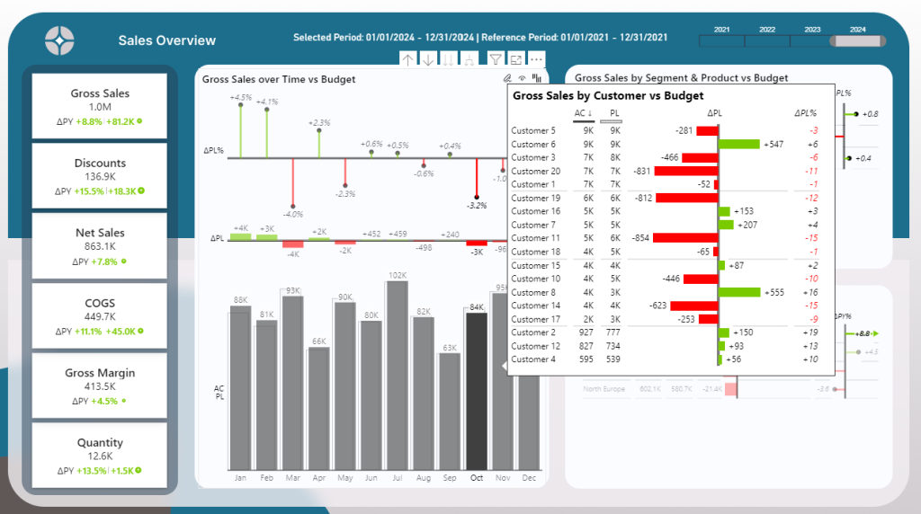
Tooltips are great for breaking down complex data. You can include metrics, trends, or even images within them to give users more details without overwhelming them. The flexibility of Power BI tooltips makes them essential for dynamic reporting. In my Power BI report below, I am currently hovering over the month of October. The tooltip automatically appears. In this case I can see the trend by Customer and explore which customer caused the negative Year over Year trend in more detail.
5 Reasons why Tooltips are a great way to make your report more effective:
- Adds Context: Tooltips show extra details without cluttering the main visual.
- Better User Experience: Users easily get insights by hovering over data points.
- Dynamic Exploration: Tooltips change based on the selected data, allowing deeper analysis.
- Reduces Clutter: Keeps visuals clean while offering more information when needed.
- Customizable: Tooltips can include charts, text, and images for tailored insights.
Creating Dynamic Power BI Tooltips
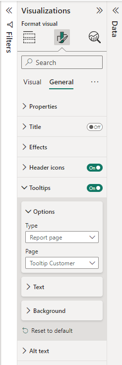
Setting up tooltips in Power BI is simple. First, you need to create a new page dedicated to your tooltip content. Go to the Format Pane and then under Canvas settings select Tooltip.
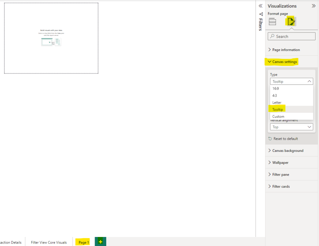
The canvas size automatically reduces, but don’t worry! If you select custom afterwards, you can resize the tooltip.
Pro Tip: Make sure to hide the tooltip page in your Power BI Desktop file. Nobody should see this page once this report is published in the Power BI Service. Tooltips only come into effect in combination with other visuals to provide extra insights! To hide a page, simply perform a right mouse click and select “hide”.
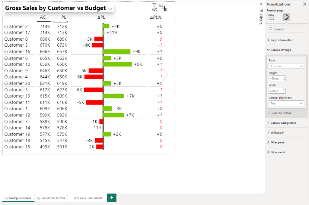
Additionally, it’s a best practice to rename your tooltip page. This makes it easier to find later on and is simply clearer! In my case, I set the canvas settings to 400 x 450 pixels and called the page “Tooltip Customer”. This is a clear indication what this tooltip is about. Of course, you can choose more pixels. In my opinion, tooltips should not be that big and definitely not fill out the whole page!
What data to include in the Power BI tooltip?
The tooltip itself is just like another visual. In my case I added a simple Zebra BI table comparing actuals with previous year, forecast and budget, depending which parameter is selected. If you want to know more about how to create a dynamic title in Power BI visuals view my recent blog posts:
How to Handle the Selected Value Field Parameter in Power BI
Using Power BI Dynamic Values for Flexible Reporting
One of the coolest features is that tooltips can be dynamic, adjusting based on the data point you hover over. For example, if you’re looking at regional sales data, the tooltip can display specific details about the region you’re focused on. This makes tooltips a powerful tool for drilling down into data without extra clicks.
How to add power bi tooltips to a visual?
Once you created the separate page for the tooltip, head over to your main page. Tooltips don’t apply automatically. You need to choose the visuals individually:
- Select the visual which should get a tooltip
- Go to Format Tab
- Select General
- In the tooltips section under Page change from Auto to the page name that you have given the tooltip page. In my case “Tooltip Customer” (This is why renaming is important).
*Note: I am not using the new “Ob object Orientation Layout” but rather the classic Power BI look. Depending on your version and settings, the screen might look different. However, activating a tooltip will remain the same logic.
Customizing Power BI Tooltips for Better User Experience
To make the most out of Power BI tooltips, you should focus on customization. Use visuals that fit the context of your report. Keep them simple and relevant. Adding too much information can overwhelm users and defeat the purpose of having a tooltip in the first place.
Also, consider using conditional formatting within your tooltips. This can change the appearance based on values or trends, adding another layer of interactivity. The goal is to make tooltips not just informative, but also engaging and visually appealing.
Why Tooltips Are Key for Dynamic Reporting
In a world where data-driven decisions are essential, having reports that provide quick and relevant insights is crucial. Tooltips enhance this by offering extra layers of information exactly when they’re needed. They reduce the need for extra pages or tabs, helping users stay focused while still getting all the details they need.
Integrating well-designed tooltips into your Power BI reports can elevate your reports from good to great. They create a smoother user experience by allowing users to explore data at their own pace. The result? More interactive reports that lead to better decision-making.
Final Thoughts
Power BI tooltips might seem like a minor feature, but they’re incredibly valuable for making reports dynamic and user-friendly. Whether you’re building dashboards for yourself or for others, adding rich tooltips can make your reports more effective and enjoyable to use. Take some time to explore how you can use tooltips creatively in your next Power BI project.
Still Confused?
Download my free Power BI Desktop file that contains everything you need to set up tooltips correctly!
If you like this type of series, I would be very happy if you give me a comment, share this post or follow me on LinkedIn.
